1 Simple Photo Editing Tip on Squarespace
Today’s How-to tip was inspired by a website template client struggling to tweak the photos on her website. The photos weren’t looking polished in her website layout as she was customizing the template.
This 1 tip I shared with her brought so much delight, I knew I had to put this little victory in your pocket, too.
Why Flipping Images is Important in Web Design
Website storytelling is made up of the words on your website and how they look and feel related to all other elements on the screen.
That includes other headlines, paragraphs, buttons, videos, and images.
You know intuitively that visuals like images are important because that’s how we learn “out in the wild.”
Some examples: Kids books have lots of pictures. Any kitchen appliance box has tons of images on the outside of the box. Even when you’re choosing which show to stream tonight on Netflix, you’ll be flipping through lots of show posters with huge images that are designed to make you feel something.
But let’s come back to websites and web marketing.
The Right Position for Images of People & Text
As a general rule, you want any image of a person or design facing towards the text next to it. I call it the Look at Me Litmus Test. Take a look at the next image.
See how the face in the image naturally draws your attention to the title of the text? It’s like the image is subtly telling you, “Go on, read this.” That’s the Look at Me Litmus Test at work; the face position draws me to focus on the text beside it.
On the flip side, a person or design moving away from text is subtly saying “don’t bother with this.” This image+text combo below doesn’t pass the Look at Me Litmus Test because the image is drawing my eye away from the text to the left of it.
The Right Position for Images of Patterns & Text
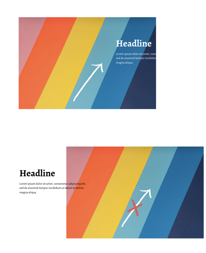
The same principle applies for patterns. Make sure any design near your text is drawing your eye towards what you want website visitors to read and not away from it.
How to Flip Images on Squarespace
So what happens if the text is where you want it to be but your imagery faces away from your text? And what if you don’t want to keep your text exactly where it is now?
In situations like these, just flip your image. Below is the same image and text combo from above, with a flipped image. Now this combo passes the Look at Me Litmus Test easily! The face position draws us to look at the text to the left of it.
Images can be flipped in Squarespace horizontally or vertically and even rotated every 90 degrees.
Flipping your image helps you expand design possibilities with where you place text and images and still get the best use from the Look at Me Litmus Test principles.
And it’s super easy! Follow the step-by-step below to learn how to flip an image on Squarespace.


